1-DAV-202 Data Management 2024/25
HWr1
See also the lecture
In this homework, try to read the text, execute given commands, potentially trying some small modifications. Within the tutorial, you will find tasks A-E to complete in this exercise.
- Submit the required files (4x .png)
- In your protocol, enter the commands used in all tasks, with explanatory comments in more complicated situations
- In tasks B and D also enter the required output to the protocol
- Protocol template in /tasks/r1/protocol.txt
Contents
The first steps
Type a command, R writes the answer, e.g.:
> 1 + 2
[1] 3
We can store values in variables and use them later:
> # population of Slovakia in millions, 2019
> population = 5.457
> population
[1] 5.457
> # area of Slovakia in thousands of km2
> area = 49.035
> density = population / area
> density
[1] 0.1112879
Surprises in the R language:
- dots are used as parts of id's, e.g. read.table is name of a single function (not a method for the object read)
- assignment via <- or =
- vectors etc are indexed from 1, not from 0
Vectors, basic plots
A vector is a sequence of values of the same type (all are numbers or all are strings or all are booleans)
# Vector can be created from a list of numbers by function named c
a = c(1, 2, 4)
a
# prints [1] 1 2 4

# c also concatenates vectors
c(a, a)
# prints [1] 1 2 4 1 2 4

# Vector of two strings
b = c("hello", "world")

# Create a vector of numbers 1..10
x = 1:10
x
# prints [1]  1  2  3  4  5  6  7  8  9 10
Vector arithmetic
Many operations can be easily applied to each member of a vector
x = 1:10
# Square each number in vector x
x * x
# prints [1]   1   4   9  16  25  36  49  64  81 100

# New vector y: logarithm of a number in x squared
y = log(x * x)
y
# prints [1] 0.000000 1.386294 2.197225 2.772589 3.218876 3.583519 3.891820 4.158883
# [9] 4.394449 4.605170

# Draw the graph of function log(x*x) for x=1..10
plot(x, y)
# The same graph but use lines instead of dots
plot(x, y, type="l")

# Addressing elements of a vector: positions start at 1
# Second element of the vector
y[2]
# prints [1] 1.386294

# Which elements of the vector satisfy certain condition?
# (vector of logical values)
y > 3
# prints [1] FALSE FALSE FALSE FALSE  TRUE  TRUE  TRUE  TRUE  TRUE  TRUE

# write only those elements from y that satisfy the condition
y[y > 3]
# prints [1] 3.218876 3.583519 3.891820 4.158883 4.394449 4.605170

# we can also write values of x such that values of y satisfy the condition...
x[y > 3]
# prints [1]  5  6  7  8  9 10
Alternative plotting facilities: ggplot2 library, lattice library
Task A
Create a plot of the binary logarithm with dots in the graph more densely spaced (from 0.1 to 10 with step 0.1)
- Store it in file log.png and submit this file
Hints:
- Create x and y by vector arithmetic
- To compute binary logarithm check help ? log
- Before running plot, use command png("log.png") to store the result, afterwards call dev.off() to close the file (in Rstudio you can also export plots manually)
Data frames and simple statistics
Data frame: a table similar to a spreadsheet. Each column is a vector, all are of the same length.
We will use a table with the following columns:
- Country name
- Region (continent)
- Area in thousands of km2
- Population in millions in 2019
(source of data UN)
The table is stored in the csv format (columns separated by commas).
Afghanistan,Asia,652.864,38.0418
Albania,Europe,28.748,2.8809
Algeria,Africa,2381.741,43.0531
American Samoa,Oceania,0.199,0.0553
Andorra,Europe,0.468,0.0771
Angola,Africa,1246.7,31.8253
# reading a data frame from a file
a = read.csv("/tasks/r1/countries.csv",header = TRUE)

# display mean, median, etc. of each column
summary(a)
# Compactly display structure of a
# (good for checking that import worked etc)
str(a)

# print the column with the name "Area"
a$Area

# population density: divide the population by the area
a$Population / a$Area

# Add density as a new column to frame a
a = cbind(a, Density = a$Population / a$Area)

# Scatter plot of area vs population
plot(a$Area, a$Population)

# we will see smaller values better in log-scale (both axes)
plot(a$Area, a$Population, log='xy')

# use linear scale, but zoom in on smaller countries:
plot(a$Area, a$Population, xlim=c(0,1500), ylim=c(0,150))

# average country population 33.00224 million
mean(a$Population)
# median country population 5.3805 million
median(a$Population)

# median country population in Europe
median(a$Population[a$Region=="Europe"])
# Standard deviation
sd(a$Population)

# Histogram of country populations in Europe
hist(a$Population[a$Region=="Europe"])
Task B
Create frame europe which contains data for European countries selected from frame a. Also create a similar frame for African countries. Hint:
- One option is to select rows using boolean expressions as in the computation of median country size in Europe above. This time we apply it on a frame rather than single column. To select some rows (and all columns) from frame a use expression of the form a[which_rows, ]. Here, which_rows can be a list, such as c(1,2,3) or a boolean expression producing a list of booleans.
- Alternatively, you can also explore subset command.
Run the command summary separately for each new frame. Comment on how their characteristics differ. Write the output and your conclusion to the protocol.
Task C
Draw a graph comparing the area vs population in Europe and Africa; use different colors for points representing European and African countries. Apply log scale on both axes.
- Submit the plot in file countries.png
To draw the graph, you can use one of the options below, or find yet another way.
Option 1: first draw Europe with one color, then add Africa in another color
- Color of points can be changed by as follows: plot(1:10, 1:10, col="red")
- After the plot command, you can add more points to the same graph by command points, which can be used similarly as plot
- Warning: command points does not change the ranges of x and y axes. You have to set these manually so that points from both groups are visible. You can do this using options xlim and ylim, e.g. plot(x,y, col="red", xlim=c(0.1,100), ylim=c(0.1,100))
Option 2: plot both Europe and Africa in one plot command, and give it a vector of colors, one for each point. Command plot(1:10,1:10,col=c(rep("red",5),rep("blue",5))) will plot the first 5 points red and the last 5 points blue
Bonus task: add a legend to the plot, showing which color is Europe and which is Africa.
Expression data
The dataset was described in the lecture.
# Read gene expression data table
a = read.csv("/tasks/r1/microarray.csv", row.names=1)
# Visual check of the first row
a[1,]
# Plot control replicate 1 vs. acetate acid replicate 1
plot(a$control1, a$acetate1)
# Plot control replicate 1 vs. control replicate 2
plot(a$control1, a$control2)
# To show density in dense clouds of points, use this plot
smoothScatter(a$control1, a$acetate1)
Task D
In the plots above we compare two experiments, say A=control1 and B=acetate1. Outliers away from the diagonal in the plot are the genes whose expression changes. However distance from the diagonal is hard to judge visually, instead we will create MA plot:
- As above, each gene is one dot in the plot (use plot rather than smoothScatter).
- The x-axis is the average between values for conditions A and B. The points on the right have overall higher expression than points on the left.
- The y-axis is the difference between condition A and B. The values in frame a are in log-scale base 2, so the difference of 1 means 2-fold change in expression.
- The points far from the line y=0 have the highest change in expression. Use R functions min, max, which.min and which.max to find the largest positive and negative difference from line y=0 and which genes they correspond to. Functions min and max give you the minimum and maximum of a given vector. Functions which.min and which.max return the index where this extreme value is located. You can use this index to get the appropriate row of the dataframe a, including the gene name.
- Submit file ma.png with your plot. Include the genes with the extreme changes in your protocol.
Clustering applied to expression data
Clustering is a wide group of methods that split data points into groups with similar properties. We will group together genes that have a similar reaction to acids, i.e. their rows in gene expression data matrix have similar values. We will consider two simple clustering methods
- K means clustering splits points (genes) into k clusters, where k is a parameter given by the user. It finds a center of each cluster and tries to minimize the sum of distances from individual points to the center of their cluster. Note that this algorithm is randomized so you will get different clusters each time.
- Hierarchical clustering puts all data points (genes) to a hierarchy so that smallest subtrees of the hierarchy are the most closely related groups of points and these are connected to bigger and more loosely related groups.
# Create a new version of frame a in which row is scaled so that
# it has mean 0 and standard deviation 1
# Function scale does such transformation on columns instead of rows,
# so we transpose the frame using function t, then transpose it back
b = t(scale(t(a)))
# Matrix b shows relative movements of each gene,
# disregarding its overall high or low expression

# Command heatmap creates hierarchical clustering of rows,
# then shows values using colors ranging from red (lowest) to white (highest)
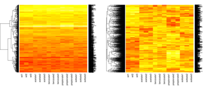
heatmap(as.matrix(a), Colv=NA, scale="none")
heatmap(as.matrix(b), Colv=NA, scale="none")
# compare the two matrices - which phenomena influenced clusters in each of them?
# k means clustering to 5 clusters
k = 5
cl = kmeans(b, k)
# Each gene is assigned a cluster (number between 1 and k)
# the command below displays the first 10 elements, i.e. clusters of first 10 genes
head(cl$cluster)
# Draw heatmap of cluster number 3 out of k, no further clustering applied
# Do you see any common pattern to genes in the cluster?
heatmap(as.matrix(b[cl$cluster==3,]), Rowv=NA, Colv=NA, scale="none")

# Reorder genes in the whole table according to their cluster cluster number
# Can you spot our k clusters?
heatmap(as.matrix(b[order(cl$cluster),]), Rowv=NA, Colv=NA, scale="none")

# Compare overall column means with column means in cluster 3
# Function apply runs mean on every column (or row if 2 changed to 1)
apply(b, 2, mean)
# Now means within cluster 3
apply(b[cl$cluster==3,], 2, mean)

# Clusters have centers which are also computed as means
# so this is the same as the previous command
cl$centers[3,]
Task E
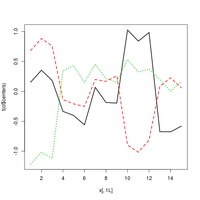
Draw a plot in which the x-axis corresponds to experiments, the y-axis is the expression level and the center of each cluster is shown as a line (use k-means clustering on the scaled frame b, computed as shown above)
- Use command matplot(x, y, type="l", lwd=2) which gets two matrices x and y of the same size and plots each column of matrices x and y as one line (setting lwd=2 makes lines thicker)
- In this case we omit matrix x, the command will use numbers 1,2,3... as columns of the missing matrix
- Create y from cl$centers by applying function t (transpose)
- Submit file clusters.png with your final plot
Task F
Only for students intermediate / advanced in R.
In task E, each cluster was represented by its center. However, we would like see the spread of values over all genes assigned to the cluster. Use ggplot2 to create a boxplot for each cluster, with a box for every experiment, showing the median, quartiles, range and outliers over all genes assigned to that cluster.

